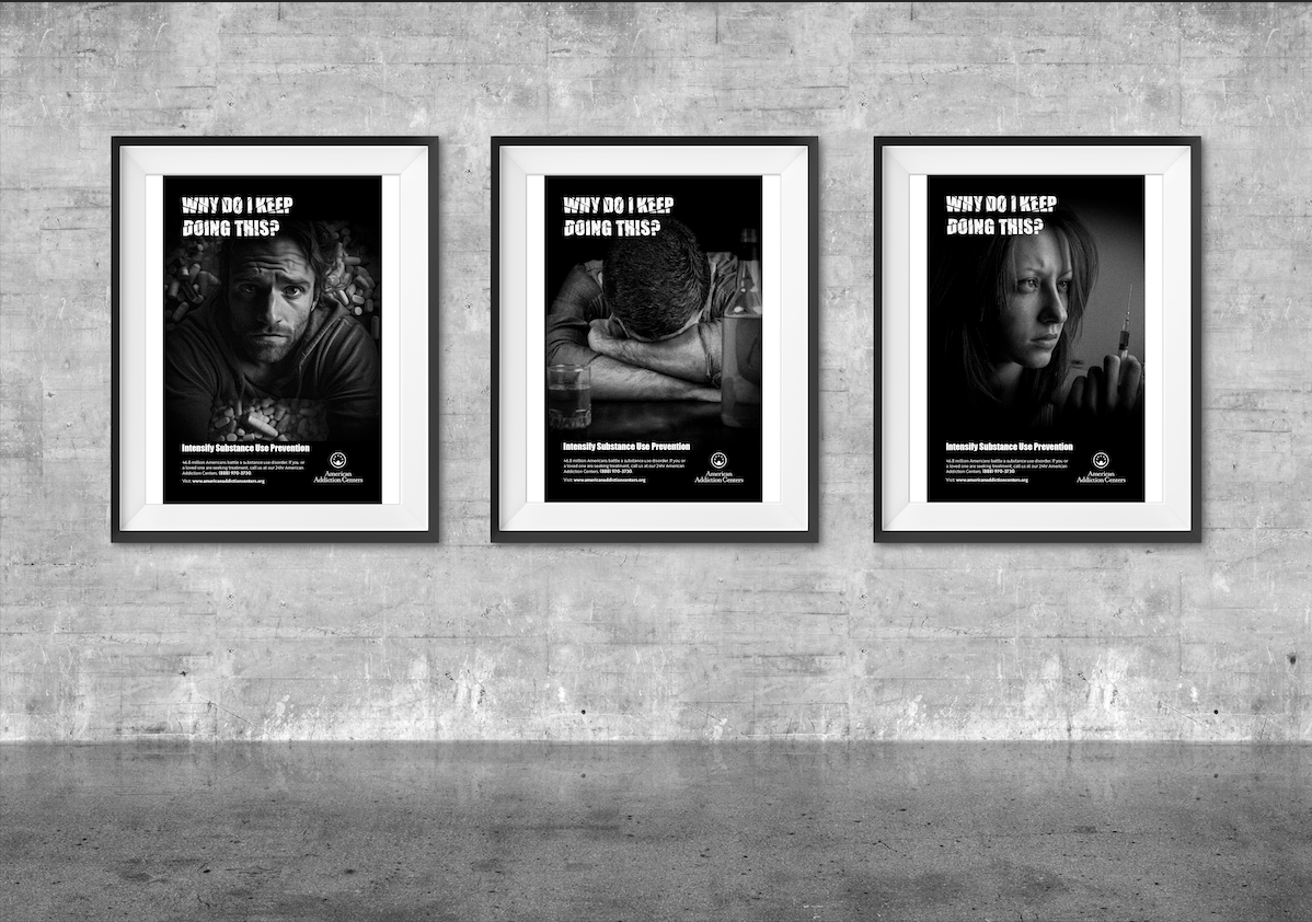
Why Do I Keep Doing This?
Programs Used:
Adobe Indesign, Adobe Illustrator and Photoshop
Project Origin:
Senior Portfolio
Project Purpose:
Spreading awareness on substance abuse
Year Completed:
2024
How it started...
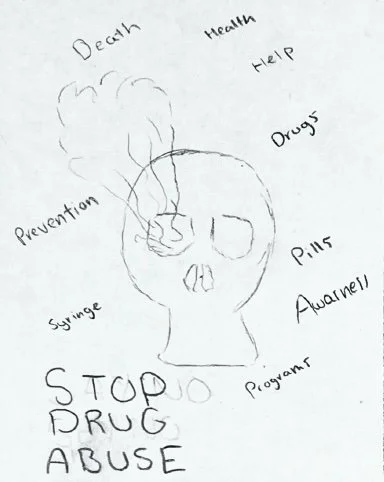
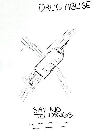
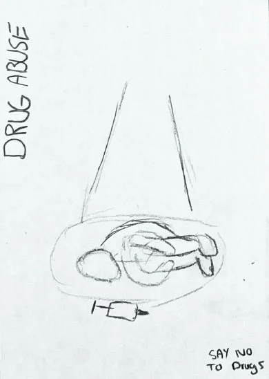
The theme I chose for this project was addiction. It contains visuals of drug usage and alcohol. Each design has a call to action for help. This was how the sketching process started. The sketches on the right show the theme I was pursuing, and would slowly develop to follow a cohesive theme.
CMYK 0, 0, 0, 100
RGB 0, 0, 0,
HEX 000000
Impact
ABCDEFGHIJKLMNOPQRSTUVWXYZ
abcdefghijklmnopqrstuvwxyz
123456789
Brother 1816 (book)
ABCDEFGHIJKLMNOPQRSTUVWXYZ
abcdefghijklmnopqrstuvwxyz
123456789
This project required us to develop a triptych poster design with a cohesive theme. The posters need to produce a series of deliverables that are appropriate and relevant for their topics. This would also highlight the delivery of the message and work as an emotional representation, both conceptually and visually.
Brother 1816 is a simplistic clean typeface that gives a professional look. It is easy to read which makes it easy to understand and communicate your message thoroughly. Impact has a strong edge look to the design that I wanted to use for my call to action.
Brother 1816 (Bold)
ABCDEFGHIJKLMNOPQRSTUVWXYZ
abcdefghijklmnopqrstuvwxyz
123456789
Color palette
Typography
CMYK 0, 0, 0, 4
RGB 255, 255, 255
Developing the idea digitally
In order to get a dark, foreboding look, I kept it simple with a black and white color scheme. The images in the background have a grainy look to give it a rough edge which then feeds into the story of addiction.
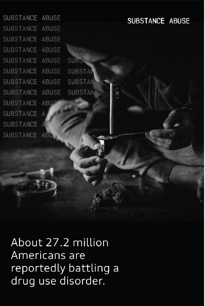
In my original concepts I wanted to present a scary feeing by adding jarring facts about addiction but by doing so I would forget an important component, which was my call to action. I would quickly end up removing the substance abuse in the background due to its inconsistency. As I developed my design further I added a more dramatic effect on my header substance abuse. I would also incorporate different images to help evoke the dark theme of substance abuse.
Finalizing my design
With this final design I changed my headline to “Why do I keep doing this?” I felt this gave the headline a little more uniqueness. I changed the images in the background and aligned the eyes to stay consistent. I also added the full logo design for the American Addiction Center. Each image shows a different type of addiction.
HEX ffffff
The dark theme I chose for this project would help evoke a dark and ominous feeling.The emotions felt through the choice in color correlate with the idea of substance abuse.

