Personal Brand
Programs Used:
Adobe Illustrator and Adobe Indesign
Project Origin:
Senior Portfolio
Purpose:
Brand Identity
Year Created:
2024
How It started…
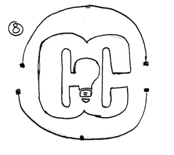
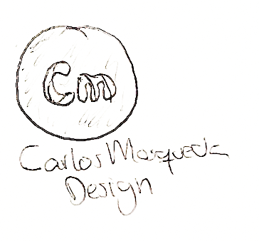
I first started by grabbing my initials and arranging them in many different patterns. I played around with a variations of marks to make the logo look minimalist, without forgetting that it must be sizable, memorable, and easy to read.
With trial and error, I would eventually select one and take it another step forward by simplifying it a bit more. In some sketches, I only used my name, but would quickly notice it would not work as my mark.
As I created my brand, my aim is for the client to immediately know who I am as a designer. I wanted my design to have a clean professional appearance with a minimalistic aspect.
In my creative process, I like to deep-dive in understanding who my client is and what they are looking for. This is the reason why my main goal was to show who I am.
Going Digital
CMYK 0, 0, 0, 4
RGB 255, 255, 255
HEX ffffff
CMYK 86, 70.62, 53.09, 55.86
RGB 29, 45, 58
HEX 1d2d3a
Typography
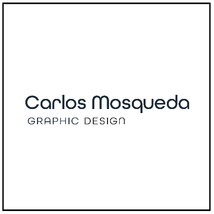
When researching for typefaces, I was looking for something that was easy to read while maintaining a consistent design. In this case, I would use the same typeface I used for my “mark” and applied it into my name, followed by “graphic design”.
“Carlos Mosqueda” would end up using a type called All Round Gothic (Demi). Graphic design uses “All Round Gothic (Book).
Color Palette
I went with a dark cool color scheme for a calm cool approach.
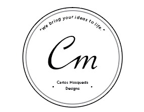
While creating my digital designs, I noticed some of my creations were not sizable. The thin type was not working due to it not being legible if shrunken or stretched smaller. I also tried using a slogan in my logo, but it seemed unnecessary and forced. Creating these digitals had me experimenting with organic and geometric styles.
All Round Gothic (Demi)
ABCDEFGHIJKLMNOPQRSTUVWXYZ
abcdefghijklmnopqrstuvwxyz
All Round Gothic (Book)
ABCDEFGHIJKLMNOPQRSTUVWXYZ
abcdefghijklmnopqrstuvwxyz
Digital Iterations
Final Design and Lockups
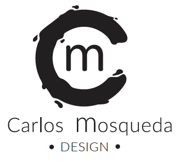
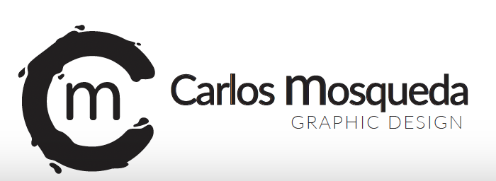
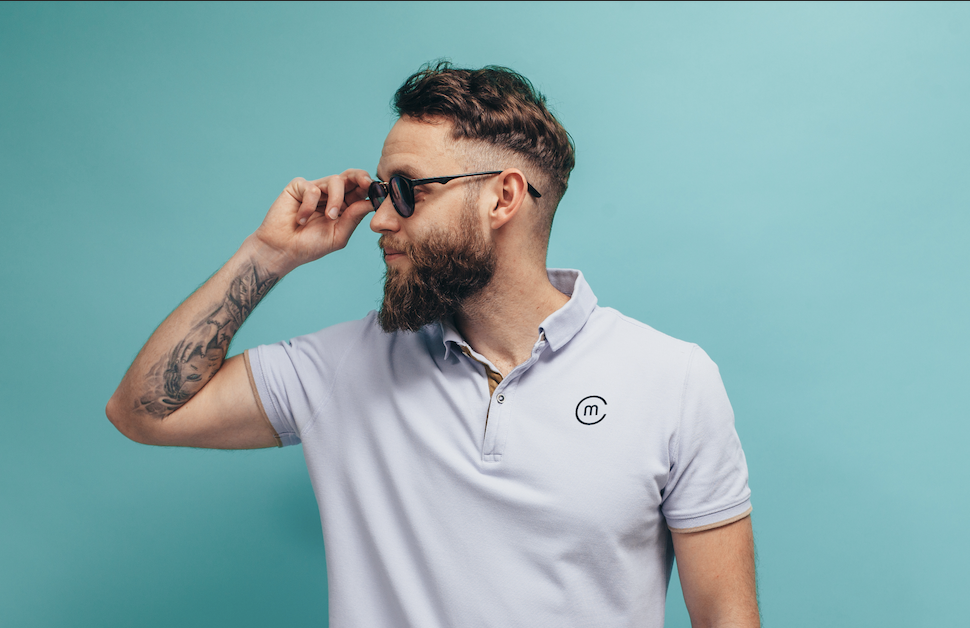
The alternate designs show the versatility of the logo and also keeping the soul identity of my style. Each lock up has a unique look for different scenarios.
Business Stationary
I wanted my business card to express my design identity. I went with a simple minimalistic approach to my cards. The back of my card has my brand symbol on a dark blue background, which originates from the original logo color. The front of my card has my full logo with my contact information. The dimensions of my business cards are 3.5in x 2in.
I ended up messing around with different typefaces and seeing which one fits best with my monogram. I knew for a fact though I wanted my monogram to be consistent with the typeface. I didn’t really like how some of the C’s looked too much like a horse shoe. I was mainly looking for one that had a more circular shape. That is when I came across “All Round Gothic.”
With my final iteration, I moved graphic design to the left instead. I also tired to align the “m” from my monogram as closest to the baseline of the “C” in Carlos.


