Seoul 2026 Olympics
Programs Used:
Adobe Illustrator, Adobe Indesign, Adobe Photoshop
Project Origin:
Sign and Symbol
Project Purpose:
Designing a Winter Olympics for Seoul
Year Completed:
2023
Process
Logo Inspiration
In my research, I took into consideration the primary language they spoke, traditions, beliefs and symbols that represent Seoul.
An important symbol for South Korea is called the Sam-Taegeuk. This symbol shares some similarities with the Chinese Yin-Yang. The design symbolizes the Cheo-Ji-In Trinity.
Blue = Heaven
Red = Earth
Yellow = Humanity
Heaven influences Earth, Earth influences Humanity, and Humanity influences Heaven. When the three tear drop designs are pieced together, it forms a perfect circle, showing balance in their culture.
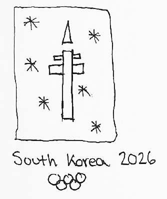
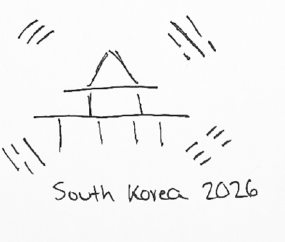
Concept Sketches with pictograms
Digital Concepts
My digital concept idea were built from the idea of the landmark which would eventually change as I directed myself more towards studying the culture. On the right side are my pictograms I created.
About
This project is intended to show how the winter Olympics would look like if it was hosted in Seoul in 2026. The project consists of in-depth research of the country in order to create a logo, merchandise, tickets and a few outdoor material.
How it began
Seoul is a beautiful city with a vibrant culture and incredible ski resorts right outside the city with many exciting winter activities. It has diverse scenery with breathtaking views and a vast city to explore.
CMYK 13.1, 96.52, 77.39, 2.85
RGB 189, 60, 68
HEX BD3C44
CMYK 0, 26.24, 100, 0
RGB 245, 194, 69
HEX F5C245
CMYK 99.93, 81.61, 4.76, 0.22
RGB 35, 74, 148
HEX 234A94
PT Sans Caption (Bold)
ABCDEFGHIJKLMNOPQRSTUVWXYZ
abcdefghijklmnopqrstuvwxyz
123456789
When I first started my started my sketches I was looking at some famous architectural structures in Seoul. One was known as the Gyeongbokung Palace and the other is the Namsan Tower. At first I took the Namsan tower route but I noticed this tower did not really define who the South Korean people are. That is when I explored the Sam Taegeuk and Hangang symbol.
Final Logo Design
This final logo design uses red, yellow and blue which are the original colors that represent the SamTaegeuk. I wanted my design to show the audience a little about Seouls beautiful culture and beliefs.
The typeface I ended up using is called “PT Sans Caption.” This font is simple and easy to read. I also added a slight bold to it so it can stand out more.


