Public Library Re-branding / Kiosk
Programs Used:
Adobe Indesign, Adobe Illustrator, Adobe Photoshop
Project Origin:
Experience Design
Project Purpose:
Design a kiosk….
Year Completed:
2024
Dilemma
Public libraries strive to create a space for research, informational purposes, and to discover new novels to read. But what happens when you don’t understand the language? How do we reel in different ethnic groups to our libraries?
How it started
Main points from the interviews.
Relaxed quiet place for focusing.
Lots of great resources for research purposes.
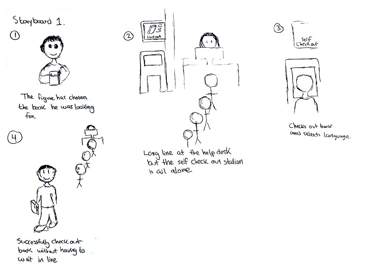
Issues with long lines when checking out books.
Language barrier can make things frustrating or difficult.
Story Boards
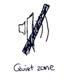
Concept Icons
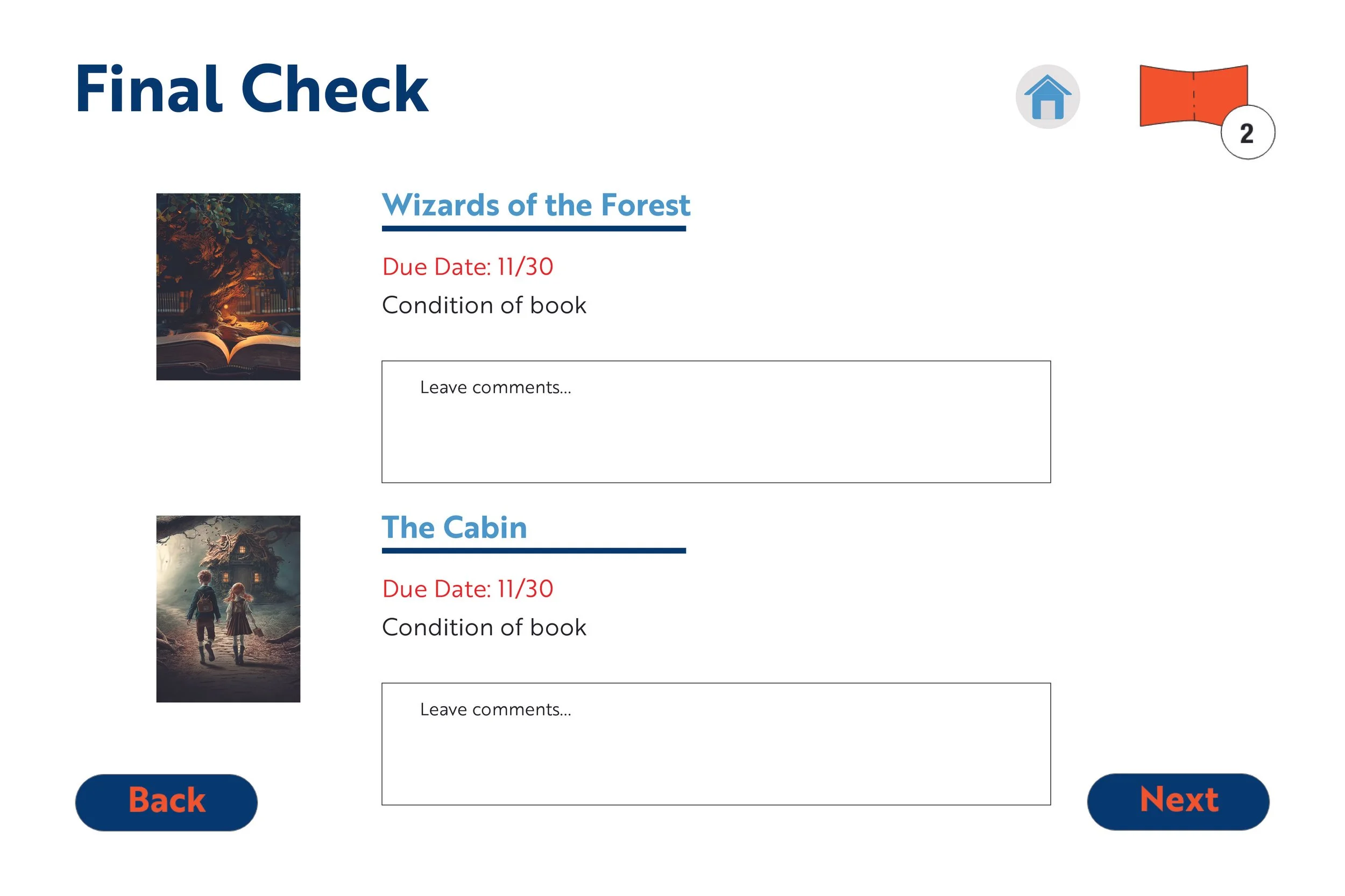
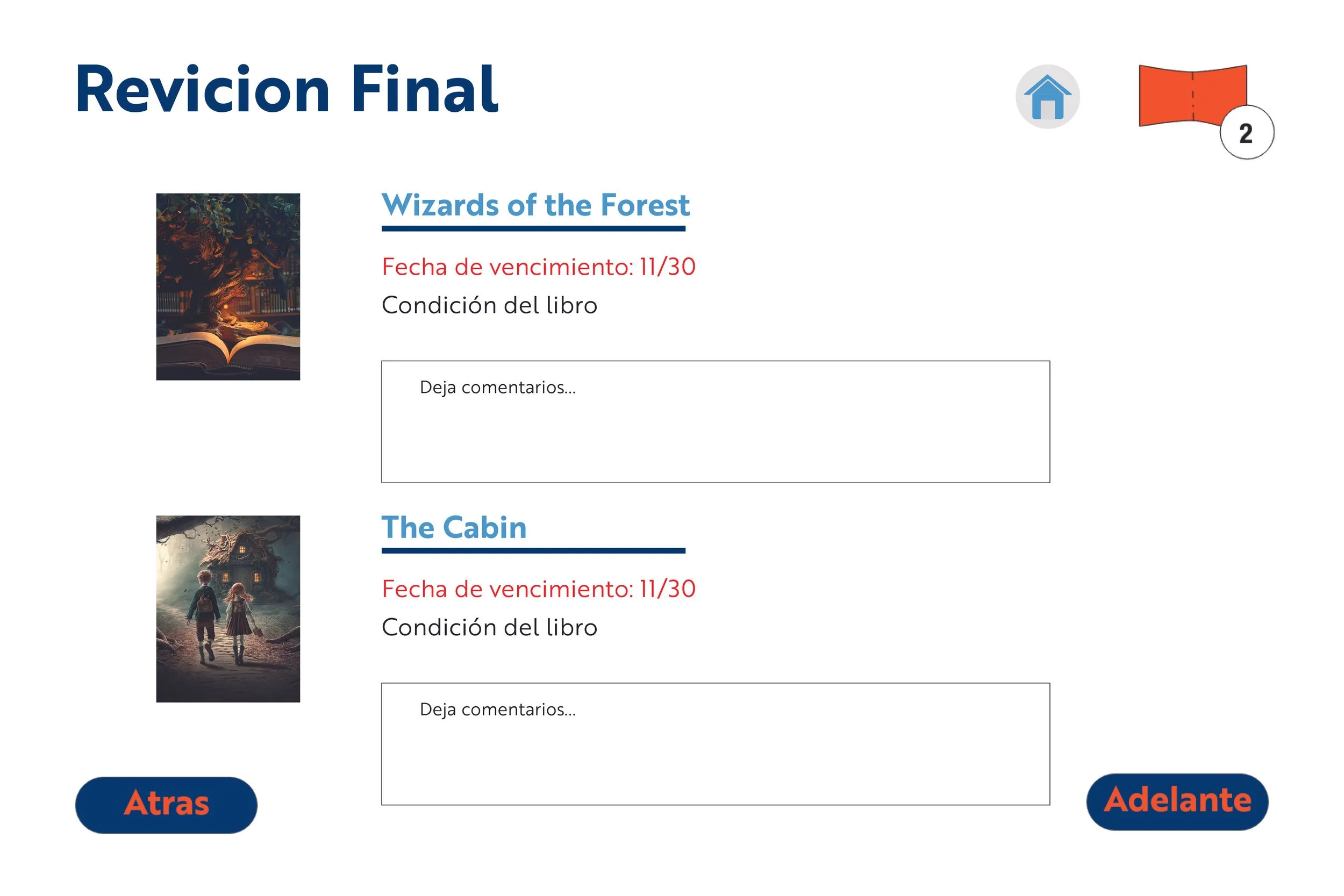
My kiosk designs show different concepts of how each screen would look like. They also incorporate a few of my icons I created.
Creating A Logo
For this project, we were asked to choose one design scenario that contained a dilemma or obstacle to solve. I traveled to my local library and conducted my research to fit this criteria. I created a map of the place and also interviewed a few individuals.
Research
Foreign-born Hispanics are less likely to have library cards than white and black individuals.
Non-English speakers are more likely to not utilize a public library.
42% of US-born Hispanics find it difficult to use library websites.
When creating my icons, I already had the idea of creating a kiosk design that would help people check out their books much quicker. I had an idea of designing another section where you can search books, but would end up scrapping it. I wanted my kiosk to primarily focus on checking out books.
Helvetica (regular)
ABCDEFGHIJKLMNOPQRSTUVWXYZ
abcdefghijklmnopqrstuvwxyz
123456789
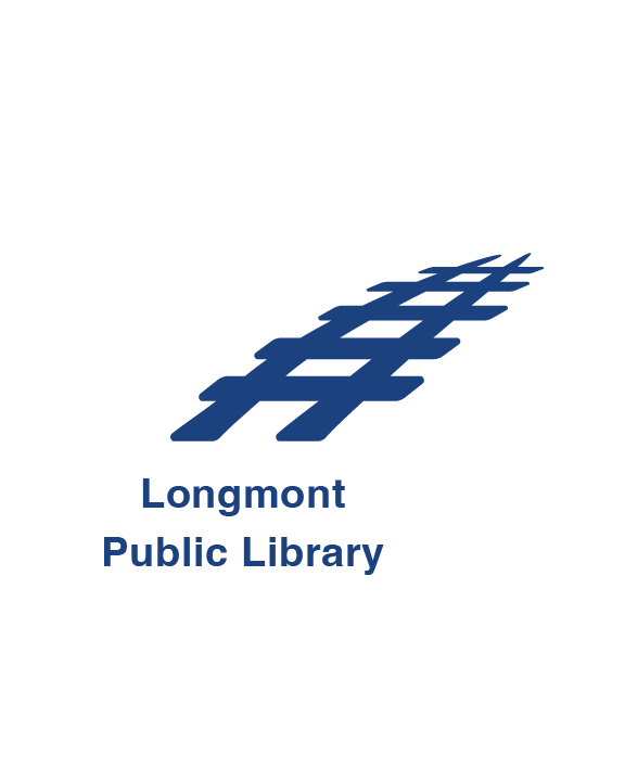
Final Logo Design with lockups:
When conjuring ideas for my logo, I delved into researching the local library in the city of Longmont.
The Longmont Public Library has been around since 1972. A major part of what kick-started the city of Longmont was the Burlington Railroad Station off of First Avenue and Main Street. This would connect Denver Pacific and the Kansas Pacific Railroads to reach Denver. Essential goods and transportation were some of the essential utilities this train system provided.
Typography
Brothers 1860 (book)
ABCDEFGHIJKLMNOPQRSTUVWXYZ
abcdefghijklmnopqrstuvwxyz
123456789
Color Palette
The color palette for my logo will have a blue value because of its calm appeal. It also represents inspiration and imagination which is a huge idea that wraps around a library.
Logo Typography :
While playing around with type, my main goal was making the wording easy to read. I tried four different types of fonts and played with the heaviness of the strokes. I chose Helvetica (regular).
For my kiosks I would use Brothers 1860 with different weight variations. This typeface has a smooth look with no hard edges, which is more inviting for a kiosk design.
Kiosk Typography :
The kiosk design will have brother 1860 due to its flexibly and readability. I want the customers to have an easy time reading and following the instruction.
CMYK: 100, 85.44, 22.69, 7.71
RGB: 21, 64, 125
HEX: #15407d
CMYK: 0, 0, 0, 4
RGB: 255, 255, 255
HEX: #ffffff
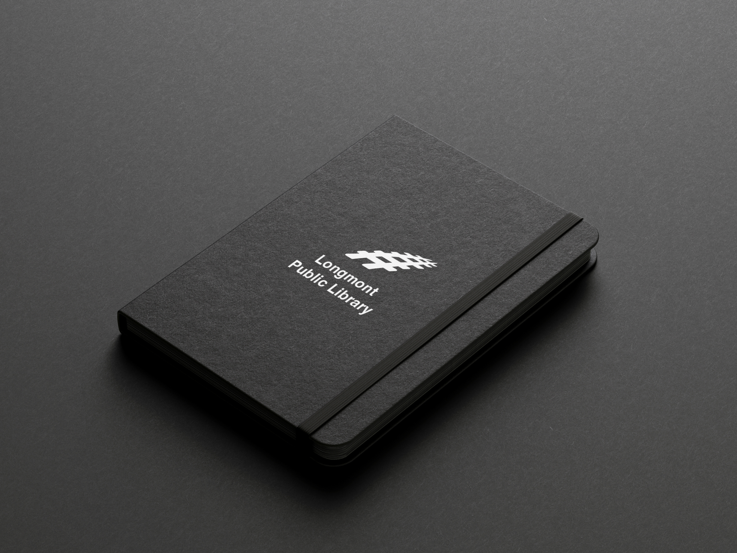
With my final logo design, I took off the curve in the beginning of the railroad. I also placed Public Library below to leave “Longmont” on its own. My aim for this re-design was a more simplistic approach, but easily memorable. The logo also comes in an all white version.
The decision behind the color blue came from the color palette that the city of Longmont uses on their official government website. I also felt that the color blue was suitable due to its meaning of inspiration, wisdom and serenity.
Kiosk Design:
English
Spanish

